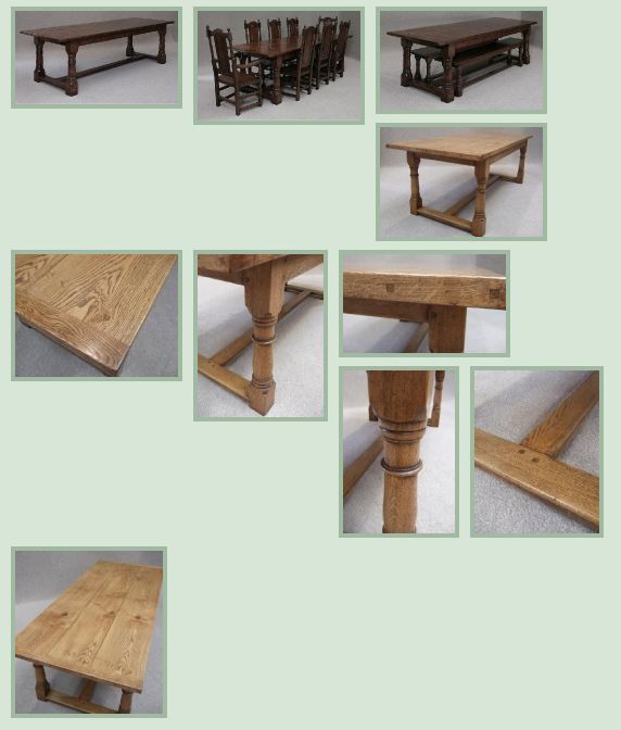
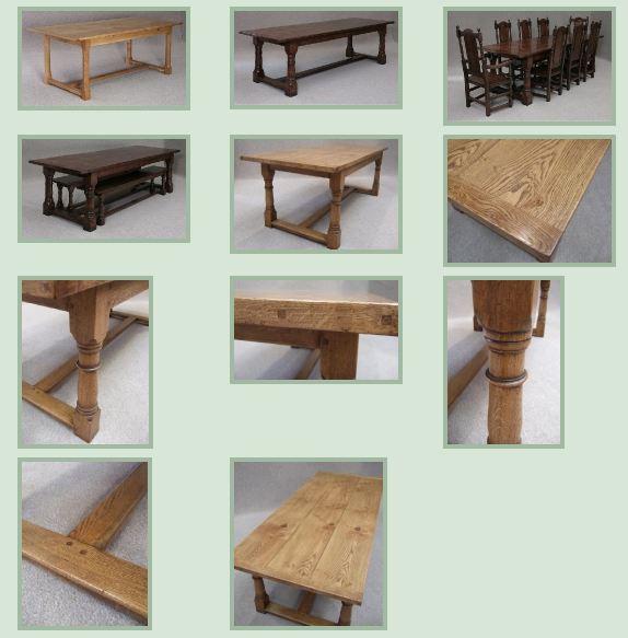
 The NextGen Gallery WordPress Plugin is a pretty amazing tool but it suffers a pretty ugly thumbnail alignment issue when used straight out of the box. That said, it’s an easy fix and only requires a few clicks, no code.
Here’s a ‘before and after’ shot:

Before you can see that the gallery really looks messy. This is a real screenshot taken from a client’s website prior to this modification being implemented.
This misalignment is often a problem with css styling on ‘stacked’ images which have different sizes.

Here the images are dropped into 3 invisible columns, great for aligning multiple images. There is still some background that shows through but this is unavoidable given the image dimensions.
To do this simple modification, first, go to the WordPress admin back end
Select Gallery
Options
Gallery tab (on top)
Select the number of columns based on your template post width. I’d start with 3 for post widths around 590px and vary this to suit.
Hit the ‘Save changes’ button and you’re done!

THAAAAAAAAAAAANK YOOOOOOOOOOOOOOOOOOOOUUUUUUUUUUUUUUUUUUU!!!! Something I thought was complicated to fix made so simple! I REALLY, REALLY, appreciate it! When I did what you said I just laughed at myself. Fixed.
I have NEVER BEEN SO HAPPY ABOUT A POST IN MY LIFE! Thank you SO MUCH. I’ve been so frustrated by this for so long. You have no idea how much you helped. THANK YOU!! 🙂
This is a great quick fix for the alignment problems. If you wanted to spend some more time, you can also try utilizing the jQuery Masonry plugin. http://masonry.desandro.com/ It does a great job of displaying various sized elements.
Thanks for the article!
You’re welcome. Masonry looks like a useful jQuery plugin, although integration with NextGen would certainly not be for code novices.
Just come across this after a search. Cheers for that – great simple fix. I was thinking I’d have to get my CSS hat on! Thanks again 🙂